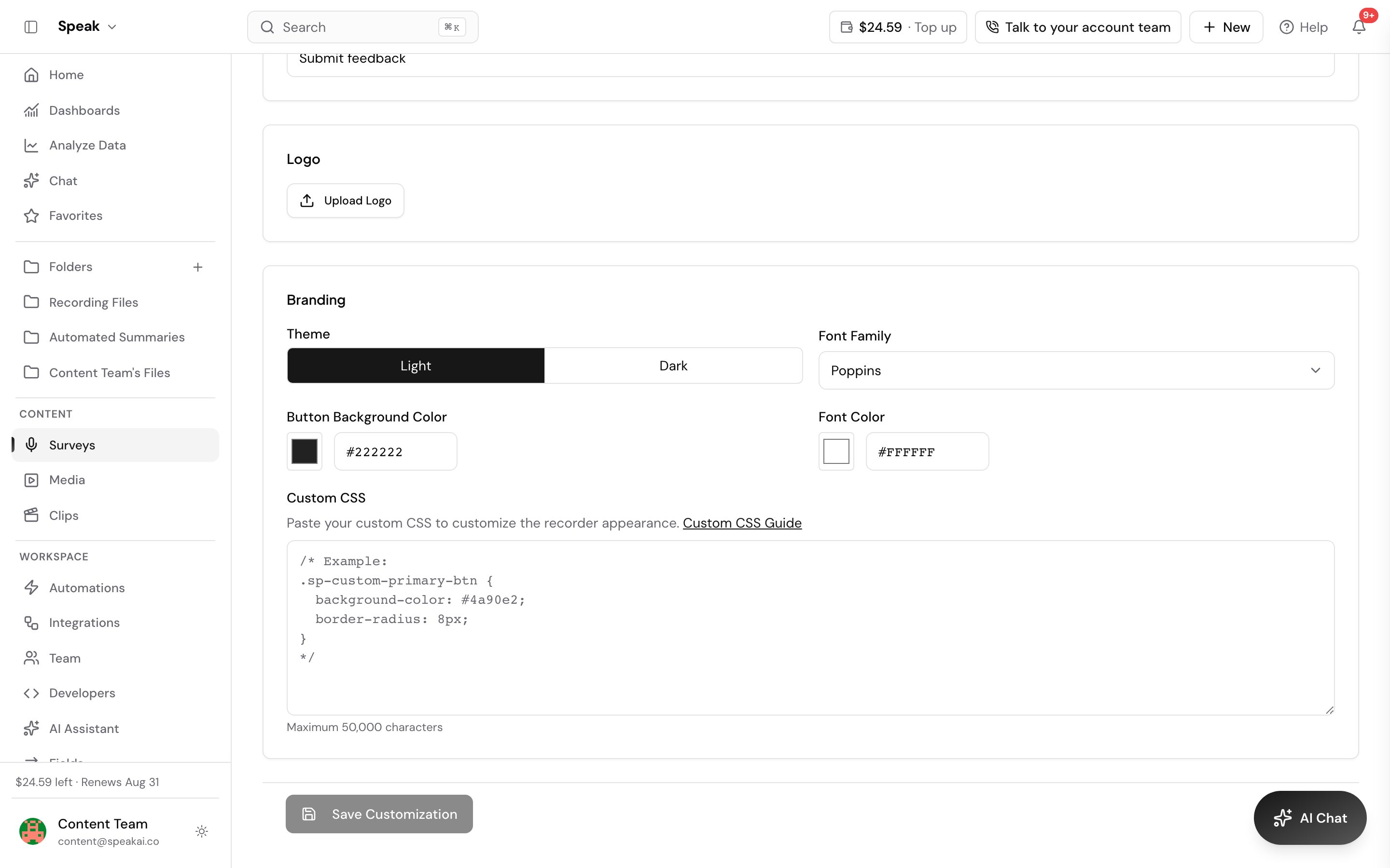
The recorder ships a set of hooks you can style with plain CSS, so it can match your brand instead of looking like a bolted-on widget. Add your rules in the Custom CSS section of the recorder settings and save. The recorder picks them up on the next load. Only the appearance changes: recording, uploading and analysis work exactly as before.
What you can restyle
| Component | CSS class | Description |
|---|---|---|
| Primary buttons | .sp-custom-primary-btn |
Start, Stop, Submit, Upload, Record again |
| Secondary buttons | .sp-custom-secondary-btn |
Cancel and Back actions |
| Card containers | .sp-custom-card |
Wrappers for grouped content |
| Input fields | .sp-custom-input |
Text and password inputs |
| Dropdowns | .sp-custom-dropdown |
Custom select inputs |
| Waveform | .sp-custom-waveform |
The audio waveform |
| Audio player | .sp-custom-audio-player |
Embedded audio playback controls |
| Video player | .sp-custom-video-player |
Video playback controls |
| Dialogs | .sp-custom-dialog |
Confirmation and modal windows |
| Titles | .sp-custom-title-1 to .sp-custom-title-6 |
Title headings, one class per heading level |
| Description | .sp-custom-desc |
The recorder description text |
Write a rule against any of these class names and the recorder applies it. You can override colors, typography, borders, padding, animation and shadows. You do not need !important: the recorder already gives these classes higher priority than its own defaults.
Example stylesheet
This block covers a title, the description text, both button styles, a card, an input, a dropdown, the waveform, both players and a dialog. Swap the colors and the font for your own and you have a full theme.
/* Title */
/* Available classes: sp-custom-title-1 through sp-custom-title-6 */
.sp-custom-title-3 {
  color: #0F0F0F;
  font-family: 'Poppins', sans-serif;
  font-size: 1.75rem;
  font-weight: 600;
  margin-bottom: 16px;
}

/* Description text below the title */
.sp-custom-desc {
  color: #666666;
  font-family: 'Poppins', sans-serif;
  font-size: 1rem;
  font-weight: 400;
  line-height: 1.6;
  margin-bottom: 20px;
}

/* Primary button */
.sp-custom-primary-btn {
  background-color: #0F0F0F;
  color: white;
  border: none;
  border-radius: 8px;
  padding: 12px 24px;
  font-family: 'Poppins', sans-serif;
  font-size: 16px;
  font-weight: 600;
  cursor: pointer;
  transition: all 0.2s ease;
}

.sp-custom-primary-btn:hover {
  background-color: #545454;
}

/* Secondary button */
.sp-custom-secondary-btn {
  background-color: transparent;
  color: #0F0F0F;
  border: 2px solid #0F0F0F;
  border-radius: 8px;
  padding: 10px 22px;
  font-family: 'Poppins', sans-serif;
  font-size: 16px;
  font-weight: 600;
  cursor: pointer;
  transition: all 0.2s ease;
}

.sp-custom-secondary-btn:hover {
  background-color: #FAFAFA;
}

/* Card */
.sp-custom-card {
  background-color: #FAFAFA;
  border: 1px solid #E0E0E0;
  border-radius: 8px;
  padding: 16px;
  box-shadow: 0 2px 4px rgba(0, 0, 0, 0.1);
}

/* Input field */
.sp-custom-input {
  border: 1px solid #E0E0E0;
  border-radius: 4px;
  padding: 8px 12px;
  background-color: white;
  font-family: 'Poppins', sans-serif;
  font-size: 14px;
  color: #0F0F0F;
}

.sp-custom-input:focus {
  border-color: #0F0F0F;
  outline: 2px solid rgba(15, 15, 15, 0.2);
  outline-offset: 2px;
}

/* Dropdown */
.sp-custom-dropdown {
  border: 1px solid #E0E0E0;
  border-radius: 4px;
  background-color: white;
  font-family: 'Poppins', sans-serif;
}

.sp-custom-dropdown:focus {
  border-color: #0F0F0F;
  outline: 2px solid rgba(15, 15, 15, 0.2);
  outline-offset: 2px;
}

/* Waveform */
.sp-custom-waveform {
  background-color: #FAFAFA;
  border: 1px solid #E0E0E0;
  border-radius: 4px;
  height: 80px;
  width: 100%;
}

/* Audio player */
.sp-custom-audio-player {
  width: 100%;
  height: 40px;
  border-radius: 4px;
}

/* Video player */
.sp-custom-video-player {
  width: 100%;
  height: auto;
  border-radius: 8px;
  background-color: #000000;
}

/* Dialog */
.sp-custom-dialog {
  background-color: white;
  border-radius: 8px;
  padding: 24px;
  box-shadow: 0 4px 16px rgba(0, 0, 0, 0.15);
}
Best practices for your CSS
- Target the classes above. A broad selector such as
buttonreaches parts of the recorder you did not mean to touch. - Test in light and dark themes. Pick colors with enough contrast that the text stays readable on both backgrounds.
- Define hover and focus states. Focus styles are what keyboard users navigate by, so do not remove the outline without replacing it.
- Make disabled buttons look disabled. They should read as clearly not clickable.
- Keep transitions short. Somewhere between 0.2s and 0.3s is enough, and the interface still feels fast.
- Set every related property when you override one. If some of the default styling shows through, declare background, border, padding and font together rather than one at a time.
Never write a rule that removes a control or blocks a click. It leaves respondents unable to finish a recording:
/* Avoid this, it breaks the recorder */
.sp-custom-primary-btn {
  display: none;
  pointer-events: none;
}
Stop the recorder capitalizing typed text
Text fields can capitalize the first letter of an answer, which gets in the way when you need the input kept exactly as typed. Add this to your custom CSS to turn it off:
input, textarea {
    text-transform: none !important;
}
Some mobile keyboards still capitalize the first letter on their own. That comes from the device settings and CSS cannot override it.
If your styles do not apply
- Check the spelling of the class, character for character:
.sp-custom-primary-btn,.sp-custom-secondary-btn,.sp-custom-card,.sp-custom-input,.sp-custom-dropdown,.sp-custom-waveform,.sp-custom-audio-player,.sp-custom-video-playeror.sp-custom-dialog. - Look for a missing semicolon or a missing closing brace. One broken rule can take the rest of the block with it.
- Reload the page without the cache, with Ctrl+Shift+R on Windows or Cmd+Shift+R on a Mac, so you are looking at the latest version.
If it still looks wrong, send support your CSS and a screenshot. We can work out the rule with you without touching your integration.
Want a hand setting this up? Book a free consult and we’ll do it together on your account.
Related: Embeddable recorder · Browser support